10 Dashboard design best practices You Should Know
Discover the top 10 dashboard design best practices strategies and tips. Complete guide with actionable insights.
By Damini
16th Jan 2026
Last updated: 16th Jan 2026

A well-designed dashboard is more than just a collection of charts and graphs; it’s a powerful decision-making tool that translates complex data into clear, actionable insights. For operations managers tracking logistics, finance leads monitoring cash flow, or product managers assessing user engagement, an effective dashboard provides an at-a-glance understanding of key performance indicators (KPIs) and business health. The difference between a useful dashboard and a confusing one often lies in the application of specific, thoughtful design principles. Without them, even the most data-rich interface can become a source of frustration rather than clarity.
This guide moves beyond generic advice to provide a comprehensive roundup of actionable dashboard design best practices. We will explore ten specific strategies that address the nuanced challenges of creating truly effective internal tools. From implementing progressive information disclosure to ensure users aren't overwhelmed, to optimizing for mobile-first responsiveness and managing real-time data synchronization, each point is designed to be directly applicable.
You will learn how to build dashboards that are not only visually appealing but also highly functional, performant, and trustworthy. We will cover critical topics like contextual alerts for anomaly detection, smart filtering for deeper data segmentation, and ensuring data source transparency. The goal is to equip you with the practical knowledge needed to transform raw data into a compelling narrative, enabling faster, more informed decisions across your organization. Whether you're a developer building a new tool or a startup founder refining your metrics, these practices will help you create dashboards that drive meaningful action.
1. Progressive Information Disclosure
Progressive information disclosure is a powerful design principle that prevents user overwhelm by presenting information in layers. Instead of flooding the screen with every possible data point, this approach prioritizes a high-level summary view, allowing users to drill down into more detailed information only when they need it. This method directly addresses cognitive load, one of the biggest challenges in effective dashboard design, by making the most critical information immediately accessible.
This technique creates a more intuitive and less intimidating user experience. For example, a sales dashboard might initially display top-level Key Performance Indicators (KPIs) like total revenue, conversion rate, and new leads. A sales manager can then click on the "Total Revenue" card to reveal a more detailed report breaking down revenue by region, team, or product line.
How to Implement Progressive Disclosure
Successfully applying this principle requires a deep understanding of your users' goals.
- Prioritize Ruthlessly: Identify the top 3-5 questions your primary audience needs answered daily. Your initial dashboard view should answer these questions at a glance, without requiring a single click.
- Use Clear Visual Cues: Incorporate unambiguous indicators like chevrons, plus icons, or "View Details" links to signal that more information is available. This manages user expectations and guides them naturally toward deeper exploration.
- Layer Information Logically: Structure your drill-downs in a hierarchical manner. The first layer is the summary, the second might be a categorical breakdown (e.g., by region), and a third could be raw, tabular data for that specific category.
- Set Smart Defaults: Configure default views and filter settings based on user roles. An executive might only need the summary view, while an analyst would benefit from a deeper, pre-filtered drill-down state upon interaction.
By adopting progressive disclosure as a core tenet of your dashboard design best practices, you create a tool that is both powerful and approachable, serving the needs of diverse users without sacrificing depth.
2. Real-Time Data Synchronization with Visual Feedback
Displaying real-time data builds user trust and ensures that critical decisions are based on the most current information available. This practice involves not just fetching live data but also providing clear visual feedback that the dashboard is actively synchronized and updating. This immediate assurance is vital in fast-paced environments like operations monitoring or financial tracking, where stale data can lead to costly errors.
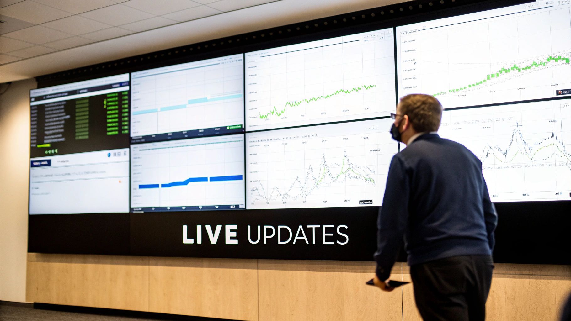
This approach transforms a static report into a living, breathing tool. For instance, Datadog's infrastructure dashboards show real-time metrics with clear status indicators, while Stripe's dashboard provides live payment processing data with a visible connection status. These cues, though often subtle, tell the user that the information they see is reliable and happening now, which is a cornerstone of effective dashboard design best practices.
How to Implement Real-Time Synchronization
Effective implementation balances performance with immediacy, ensuring the user experience is smooth, not jarring.
- Choose Efficient Tech: Utilize modern protocols like WebSockets or Server-Sent Events (SSE) for pushing data from the server. These are far more efficient than traditional short polling, reducing server load and network latency.
- Provide Clear Status Indicators: Always include a "last updated" timestamp, ideally with timezone awareness for global teams. Supplement this with subtle animations, like a pulsing dot or a brief color flash on updated numbers, to draw attention without being distracting.
- Offer User Controls: While automatic updates are key, always provide a manual "Refresh" button. This gives users a sense of control and serves as a fallback if they suspect a connection issue, reinforcing their confidence in the data.
- Implement Smart Refresh Logic: Not all data needs to update every second. Implement variable refresh rates based on data volatility. Critical operational metrics might update in near real-time, while less urgent summary data can refresh every few minutes.
3. Context-Aware Metric Visualization
Context-aware metric visualization is the practice of selecting the most appropriate chart or graph type for the specific data and the user's goal, rather than defaulting to generic visualizations. This approach recognizes that the form of the data dictates its function. A metric showing a trend over time requires a different visual representation than one comparing categories or tracking progress toward a goal. Effective visualization translates raw numbers into actionable insights.
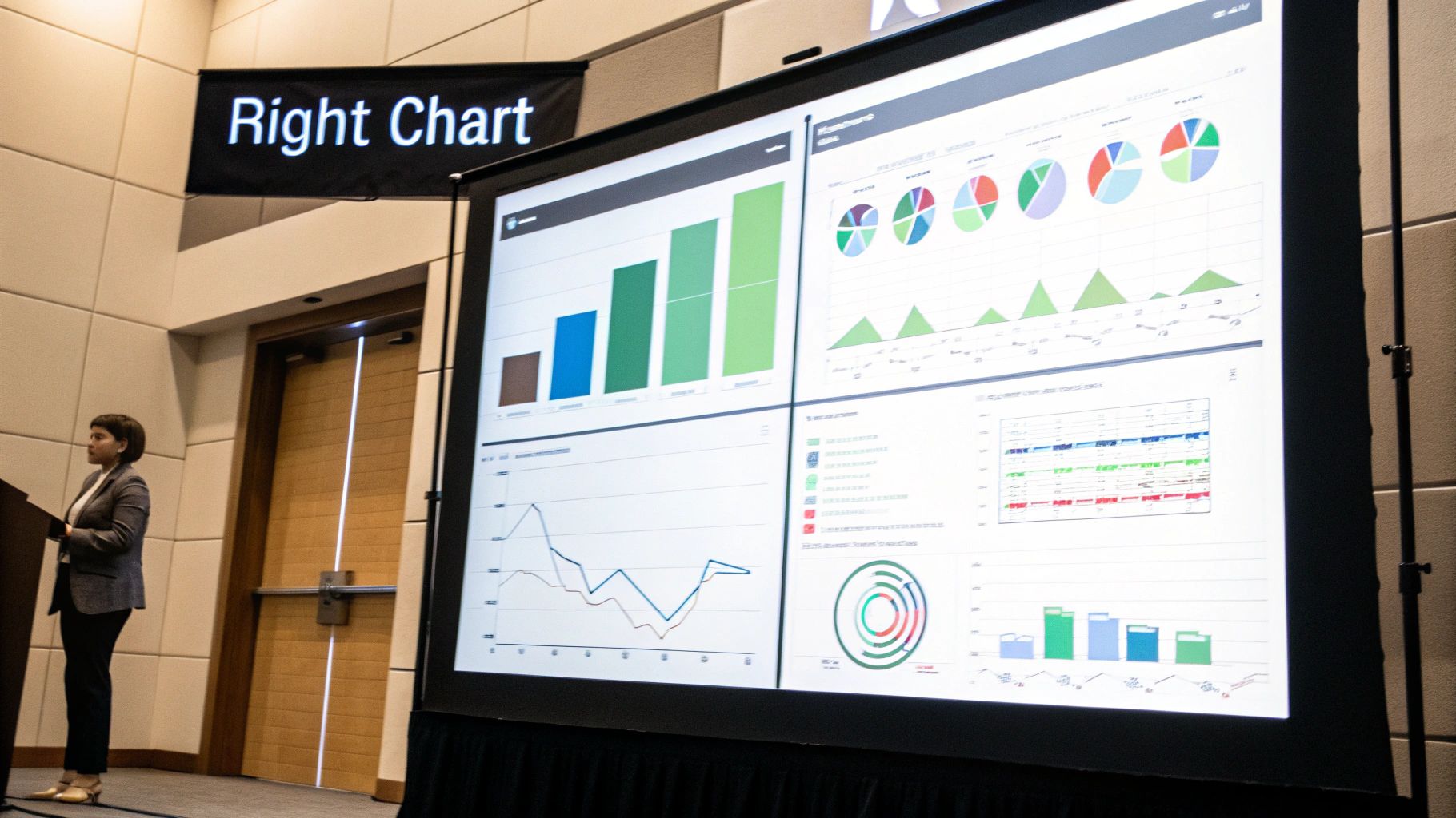
This method ensures that each component of your dashboard communicates its message with maximum clarity and minimum cognitive effort. For example, HubSpot sales dashboards use gauges to show pipeline progress against a target, offering an immediate sense of completion. For deal trends over a quarter, however, they use line charts, which are far better at illustrating change over time. This deliberate selection makes the dashboard more intuitive and powerful.
How to Implement Context-Aware Visualization
Choosing the right chart starts with understanding the question the user is trying to answer.
- Match Chart Type to User Questions: Frame your data as an answer to a specific question. Use a bar chart for "How much?", a line chart for "How has it changed?", and a grouped bar chart for "How does it compare?". A funnel chart is perfect for "Where are the drop-offs in our conversion process?".
- Provide Context with Benchmarks: Raw numbers are often meaningless without context. Include benchmark lines or target thresholds directly on charts to show performance against goals, historical averages, or industry standards.
- Limit Visual Variety: While choosing the right chart is key, avoid using too many different types on a single screen. Limiting a dashboard to 3-4 distinct visualization types maintains visual consistency and reduces the user's learning curve.
- Use Color to Highlight Status: Leverage color strategically to communicate information quickly. Use intuitive colors like green for on-target metrics, red for alerts or underperformance, and a neutral gray for informational data points.
By making context-aware choices a cornerstone of your dashboard design best practices, you ensure each visualization serves a clear purpose, transforming a collection of charts into a cohesive and insightful decision-making tool.
4. Mobile-First Responsive Design
A mobile-first approach to dashboard design flips the traditional process on its head. Instead of creating a complex desktop dashboard and then trying to shrink it down for smaller screens, this principle forces you to design for the most constrained environment first: the mobile phone. This ensures the core functionality and most critical data are accessible and usable on any device, leading to a more focused and effective user experience.

This methodology naturally promotes simplicity and prioritization. A manager checking sales figures on the go doesn't need dozens of filters; they need to see essential KPIs instantly. For instance, the Shopify mobile app presents key store metrics in a simple, swipeable card layout, making it perfect for quick checks. Similarly, Uber's driver app focuses almost entirely on the active trip status, relegating secondary metrics to other views.
How to Implement Mobile-First Responsive Design
Adopting a mobile-first mindset requires a disciplined focus on what truly matters to the user.
- Prioritize Ruthlessly for Mobile: Identify the single most critical action or piece of information a user needs on the go. Build the mobile view around this core need, stripping away everything else. This clarity will benefit larger screen designs later.
- Design for Touch: Replace hover-dependent interactions with touch-friendly alternatives like taps and swipes. Ensure buttons and interactive elements have large enough tap targets to be easily used on a small screen.
- Use a Responsive Framework: Employ CSS media queries to create fluid layouts that adapt gracefully from a single-column mobile view to multi-column tablet and desktop arrangements. This avoids creating and maintaining separate codebases.
- Optimize for Performance: Mobile users are often on slower networks. Compress images, lazy-load charts that are not immediately visible, and minimize data requests to ensure your dashboard loads quickly and reliably.
By making mobile-first a cornerstone of your dashboard design best practices, you create a flexible, focused, and universally accessible tool that meets users wherever they are.
5. Smart Filtering and Segmentation
Effective dashboards do more than just display data; they empower users to ask and answer their own questions. Smart filtering and segmentation are the mechanisms that make this possible, allowing users to slice and dice information across relevant dimensions like date ranges, regions, product lines, or teams. This transforms a static report into a dynamic, interactive analytical tool.
Implementing intelligent controls goes beyond simple dropdown menus. For instance, Google Analytics allows users to layer filters for audience, traffic source, and behavior simultaneously to uncover granular insights. Similarly, Shopify's sales dashboard filters by product and sales channel, and even generates shareable URLs that save the specific filtered view, facilitating collaboration. This functionality is crucial for creating a truly self-service analytics environment.
How to Implement Smart Filtering
Building intuitive filtering requires balancing power with simplicity. The goal is to provide robust control without overwhelming the user.
- Prioritize Filter Controls: Identify the 4-5 most critical dimensions your users need to segment by. Place these filters in a prominent, persistent location, such as a top bar or a collapsible side panel. Hide less-frequently used options under an "Advanced Filters" or "More" button.
- Provide Smart Presets: Offer one-click presets for common views like "Last 30 Days," "My Team's Data," or "High Priority Items." This saves users time and guides them toward meaningful analyses. Jira dashboards excel at this by allowing teams to save complex JQL queries as quick-access filters.
- Implement URL-Based Filtering: Make the dashboard's URL dynamically update as filters are applied. This is a game-changer for collaboration, as users can simply copy and paste the link to share their exact view with a colleague, ensuring everyone is looking at the same data.
- Offer Clear Feedback: Use filter "badges" or tags to clearly display which filters are currently active. Also include a highly visible "Clear all filters" button to allow users to quickly reset their view to the default state.
By incorporating these smart filtering techniques into your dashboard design best practices, you empower users to move beyond passive data consumption and engage in active, self-directed exploration.
6. Performance Optimization and Load-Time Management
Performance is not just a technical concern; it is a core component of user experience. A dashboard that takes too long to load is a dashboard that won't be used, regardless of how insightful its data is. Performance optimization focuses on ensuring your dashboard loads quickly and remains responsive, even when handling large datasets or high user traffic. This principle directly impacts user adoption and the perceived reliability of the tool.
Slow dashboards create frustration and erode trust in the data presented. For example, Stripe’s metrics dashboard loads essential summary cards almost instantly, while more complex, detailed charts are loaded asynchronously in the background. This allows users to get immediate value without waiting for every single query to complete, showcasing a key tenet of performance-centric dashboard design best practices. Similarly, Grafana uses downsampling for long-range time-series queries to maintain responsiveness.
How to Implement Performance Optimization
Building a high-performance dashboard requires a multi-faceted approach that addresses both the back-end queries and the front-end rendering.
- Optimize Your Queries: The foundation of a fast dashboard is efficient data retrieval. Use database indexes strategically for frequently filtered fields and pre-aggregate data where possible. Monitor query execution times and set alerts for any that exceed your performance benchmarks.
- Implement Smart Caching: Leverage caching at multiple levels. Use query-result caching with tools like Redis or Memcached to store frequently accessed data. This prevents the database from running the same complex query repeatedly for different users.
- Load Content Intelligently: Don't try to load everything at once. Use "lazy loading" to defer the initialization of charts and widgets until they are visible in the user's viewport. Displaying skeleton loaders or spinners provides crucial feedback and manages user expectations during data fetching.
- Limit Initial Data: By default, load only the most essential data for the primary view. For instance, show the last 30 days of data initially instead of the entire year, and use pagination for large tables to avoid overwhelming the browser.
By prioritizing performance from the outset, you ensure your dashboard remains a valuable, functional, and user-friendly tool that can scale with your organization's data needs.
7. Contextual Alerts and Anomaly Detection
A static dashboard only shows what has happened; an intelligent dashboard proactively tells you what needs attention now. Contextual alerts and anomaly detection transform a dashboard from a passive reporting tool into an active monitoring system. This practice involves embedding automated notifications that trigger when metrics breach predefined thresholds or when algorithms detect statistically significant deviations from normal patterns.
This approach dramatically reduces the time to discovery for critical issues. For instance, a financial dashboard can automatically flag unusual trading volume, or an e-commerce platform like Shopify can alert a merchant to a sudden drop in revenue. Tools like Datadog excel at this, using anomaly detection to highlight unusual application performance, allowing teams to act before minor issues become major outages.
How to Implement Alerts and Anomaly Detection
Effective alerting provides signal, not noise. It requires a thoughtful balance between sensitivity and user tolerance.
- Start Simple, Then Evolve: Begin with straightforward, threshold-based alerts (e.g., "Alert me if CPU usage exceeds 90% for 5 minutes"). Once these are established and proven useful, you can graduate to more complex, machine-learning-driven anomaly detection that identifies deviations from historical norms.
- Prioritize Business Impact: Set alert thresholds based on what actually matters to the business, not arbitrary percentages. An 80% disk space usage alert might be critical for a production database server but irrelevant for a temporary staging environment.
- Prevent Alert Fatigue: Be ruthless about preventing noise. Implement features that allow users to configure alert sensitivity, set "quiet hours," and group related notifications. A constant stream of low-priority alerts will train users to ignore them all.
- Provide Actionable Context: An alert that just says "Metric X is high" is unhelpful. A great alert provides context: what the metric is, the value that triggered the alert, the normal range, and ideally, a link or suggestion for the next action.
By incorporating intelligent alerting, you elevate your dashboard from a simple window into the data to a vigilant partner, making it a cornerstone of effective dashboard design best practices.
8. Collaborative Features and Shared Context
A static dashboard is a missed opportunity. To transform a dashboard from a simple reporting tool into a dynamic decision-making platform, you must incorporate collaborative features. This approach enables teams to work together directly within the dashboard, adding context, discussing insights, and making data-informed decisions in real-time. By integrating features like comments, annotations, and shared views, you create a living document that captures the "why" behind the data.
This method turns isolated analysis into a shared experience. Imagine a marketing team reviewing a campaign dashboard. Instead of exporting screenshots to a separate chat tool, a team member can comment directly on a specific chart, asking, "What caused this spike in traffic on Tuesday?" This anchors the conversation to the relevant data point, preserving context for everyone and streamlining the path from insight to action.
How to Implement Collaborative Features
Building a collaborative environment requires more than just adding a chat box. It demands thoughtful integration that enhances, rather than complicates, the user's workflow.
- Anchor Conversations to Data: Design comment threads to attach directly to specific charts, metrics, or data points. This prevents a general, unstructured chat and ensures discussions are always contextual. Looker’s ability to embed discussions on specific dashboard tiles is a great example of this.
- Implement Granular Permissions: Not everyone needs the same level of access. Provide clear roles (e.g., viewer, commenter, editor, admin) to control who can see, discuss, or modify the dashboard, ensuring data integrity.
- Provide Real-Time Presence: Use indicators, like live cursors or avatars, to show who else is currently viewing or editing the dashboard. This fosters a sense of shared space and prevents conflicting edits, similar to the experience in Google Docs or Figma.
- Integrate Smart Notifications: Allow users to subscribe to updates on specific comments or dashboard changes. This keeps stakeholders informed without overwhelming them, and an email digest can summarize activity for less frequent users.
By embedding collaboration into its core, you elevate your dashboard from a passive report to an active workspace, making it an indispensable part of your dashboard design best practices.
9. Data Accuracy and Source Transparency
A visually stunning dashboard is useless if the data is untrustworthy. Data accuracy and source transparency form the foundation of user trust, ensuring that decisions are based on reliable information. This practice involves clearly communicating where the data comes from, how it's calculated, and how fresh it is. Without this transparency, users may misinterpret metrics, question the dashboard's validity, and ultimately abandon the tool altogether.
Implementing this principle builds confidence and empowers users to understand the context and limitations of the data they see. For instance, a financial dashboard should prominently display an "As of [Date] at [Time]" timestamp, while a marketing dashboard might include info icons next to KPIs like "Customer Lifetime Value" that reveal the exact calculation formula. This context is not just helpful; it's essential for correct interpretation.
How to Implement Data Transparency
Building trust is an active process that requires embedding clarity directly into the user interface.
- Display Data Freshness Prominently: Users must know if they are viewing real-time, daily, or weekly data. Add a clear timestamp in a consistent location, such as the dashboard header, stating "Last Updated: [Date/Time]". If certain widgets have different refresh rates, note that on the specific component.
- Use Tooltips for Definitions: Place a small information icon (i) next to each metric title. On hover, this should trigger a tooltip that explains the metric's definition, the formula used for its calculation, and the source system (e.g., "Salesforce API" or "Internal Production DB").
- Indicate Data Quality: Not all data is perfect. Use visual cues to communicate its status. For example, a small colored dot next to a metric could signify its quality: green for verified, yellow for preliminary, and red for estimated or known incomplete data. This is common in public health dashboards, like those used for COVID-19 tracking.
- Link to a Data Dictionary: For complex environments, provide a "Learn More" or "Data Dictionary" link in the dashboard's footer or help section. This central document can offer exhaustive details on all metrics, data sources, and business logic, serving as a single source of truth for all users.
By prioritizing transparency, you transform a dashboard from a simple chart display into a credible and authoritative decision-making tool, a cornerstone of effective dashboard design best practices.
10. Customization, Personalization and Clear Narrative
The most effective dashboards blend flexibility with a clear, guiding story. This principle involves providing users with low-friction tools to tailor their view (customization) while ensuring the default layout tells a coherent narrative that supports decision-making. Instead of a disconnected grid of charts, the dashboard becomes a dynamic tool that both informs and guides.
This approach respects that different users have unique needs while preventing the "empty canvas" problem where users are unsure where to start. For example, a Shopify merchant dashboard leads with total sales (the primary narrative), then breaks down contributing factors like conversion rate and traffic. The merchant can still customize this view by adding a widget for top-selling products, personalizing the tool without losing the core story.
How to Implement Customization and Narrative
Balancing these two elements requires thoughtful defaults and intuitive controls.
- Provide Smart Defaults: Start users with a pre-configured dashboard tailored to their role (e.g., Sales Manager, Finance Analyst). This immediately provides value and serves as a strong foundation for any future personalization.
- Structure a Clear Story: Arrange metrics logically from top to bottom. Start with a primary KPI that answers the most critical business question, then follow with secondary metrics that provide context or explain the "why" behind the primary number. Use micro-copy to add context and suggest what actions to take.
- Enable Low-Friction Customization: Use intuitive drag-and-drop interfaces for rearranging widgets. Keep metric selection and filtering in a dedicated sidebar or modal to avoid cluttering the main view. Always include a "Reset to Default" option.
- Save User Preferences: Ensure any customizations a user makes are saved, either to local storage or synced to their cloud profile. This small detail dramatically improves the user experience, making the tool feel truly their own.
By combining a strong narrative with user-driven personalization, you create a dashboard that is both opinionated and adaptable, a key component of excellent dashboard design best practices.
Top 10 Dashboard Design Best Practices Comparison
| Pattern | 🔄 Implementation complexity | ⚡ Resource requirements | 📊 Expected outcomes | 💡 Ideal use cases | ⭐ Key advantages |
|---|---|---|---|---|---|
| Progressive Information Disclosure | Moderate — layered UI, drill-down logic | Low–Medium — front-end work, lightweight backend | Reduced cognitive load; faster summary-driven decisions | Executive summaries, mixed-expertise dashboards, mobile-first views | Summary-first clarity; scales for novices and power users |
| Real-Time Data Synchronization with Visual Feedback | High — real-time connections, sync handling | High — robust backend (WebSockets/SSE), monitoring | Immediate accuracy; higher trust; proactive ops | Monitoring, payments, live operations, incident response | Ensures data freshness; enables quick operational response |
| Context-Aware Metric Visualization | Moderate — visualization rules and mapping logic | Medium — charting libraries, design/testing | Better comprehension; fewer misinterpretations; faster insight | Analytical reporting, product metrics, executive reviews | Right chart for the question; improves insight speed |
| Mobile-First Responsive Design | Moderate–High — responsive layouts, touch UX | Medium — cross-device testing, performance tuning | Usable on all devices; faster loads; higher mobile adoption | Field ops, mobile-first teams, on-the-go decision makers | Consistent experience across devices; optimized performance |
| Smart Filtering and Segmentation | Moderate — dependent filters, persistence | Medium — query support, UI controls, URL state | Focused analysis; performance gains from smaller queries | Exploratory analysis, finance segmentation, product cohorts | Precise slicing; saved presets and shareable views |
| Performance Optimization and Load-Time Management | High — query tuning, caching, lazy-loading | High — infra, caching layers, monitoring | Faster load times; higher adoption; lower long-term costs | Large datasets, high-concurrency dashboards, analytics at scale | Responsive UX at scale; reduced server load and latency |
| Contextual Alerts and Anomaly Detection | High — rule engines or ML models, tuning | High — historical data, ML infra, notification channels | Proactive issue detection; reduced MTTR; automated monitoring | SRE/ops, fraud detection, finance risk monitoring | Early warning system; scales monitoring without constant attention |
| Collaborative Features and Shared Context | High — real-time sync, permissions, audit logs | High — collaboration backend, auth, notifications | Improved alignment; preserved discussion context; auditability | Cross-functional teams, decision reviews, distributed orgs | Enables teamwork in-context; reduces context-switching |
| Data Accuracy and Source Transparency | Moderate — metadata capture, lineage display | Medium — metadata storage, links to sources | Increased trust; easier debugging; compliance support | Finance, audits, data-governance, executive reporting | Builds confidence; explains provenance and calculation logic |
| Customization, Personalization and Clear Narrative | Moderate–High — drag/drop, saved views, narratives | Medium — templates, persistence, optional AI suggestions | Higher adoption; tailored insights; guided actions | Managers, founders, multi-role teams, tailored workflows | Flexible dashboards with narrative guidance and role defaults |
Final Thoughts
We've explored a comprehensive landscape of dashboard design best practices, moving far beyond mere aesthetics to the core of what makes a dashboard truly effective: its ability to transform raw data into a powerful engine for decision-making. The journey from a cluttered screen of numbers to an intuitive, actionable intelligence hub is built on a foundation of deliberate, user-centric design choices. Mastering these principles isn't just about creating visually appealing charts; it's about empowering your teams with clarity and enabling them to act decisively.
The ten principles we've detailed, from progressive information disclosure to ensuring data accuracy, are not isolated tactics. Instead, they form an interconnected framework. A mobile-first responsive design is only truly useful if performance is optimized for quick load times on any device. Smart filtering becomes exponentially more powerful when paired with contextual alerts that guide users to the most critical segments of their data.
Key Takeaways: From Principles to Practice
As you embark on your next dashboard project, hold these core truths at the forefront of your process. These are the most critical takeaways that bridge the gap between theory and real-world impact:
- User Context is Everything: The single most important factor is understanding who will use the dashboard and what questions they need to answer. A dashboard for a finance lead focused on quarterly P&L is fundamentally different from one for an operations manager monitoring real-time logistics. Always start with the user's "job to be done."
- Clarity Over Complexity: The goal is to reduce cognitive load, not display every possible metric. Employ progressive disclosure, choose the right chart for the data story, and use a disciplined color palette. A successful dashboard makes the right information easy to see and the complex data easy to understand.
- Build Trust Through Transparency: Your dashboard's credibility hinges on its data accuracy and source transparency. Users must trust the numbers they see. Always provide clear data sourcing, definitions for metrics, and timestamps for data freshness to build and maintain that crucial trust.
- Design for Action, Not Just Information: A dashboard fails if it only informs without enabling action. Every element, from contextual alerts and anomaly detection to smart filtering and collaborative features, should be designed to help users move from insight to decision to action as seamlessly as possible.
Your Actionable Next Steps
Applying these dashboard design best practices is an iterative process of building, testing, and refining. To put this guide into immediate action, consider the following steps:
- Audit an Existing Dashboard: Select one of your current internal dashboards and evaluate it against the ten principles discussed. Where does it excel? Where does it fall short? Identify three specific, high-impact improvements you can make this week, such as improving mobile responsiveness or adding a "last updated" timestamp.
- Define a "Narrative" for Your Next Project: Before you write a single line of code or drag-and-drop a widget for your next dashboard, write out its story. Start with the primary question it answers, then outline the supporting questions that key metrics will address. This narrative becomes your design blueprint.
- Gather User Feedback Proactively: Schedule brief, 15-minute sessions with the intended end-users. Don't just ask them what they want to see; observe how they currently find answers and ask what decisions they are struggling to make. This qualitative insight is invaluable for designing a tool they will actually use and love.
Ultimately, a well-designed dashboard is more than a tool; it's a strategic asset. It aligns teams, surfaces opportunities, mitigates risks, and fosters a data-driven culture. By investing the time to implement these dashboard design best practices, you are not just building charts; you are building a clearer, faster, and smarter path to achieving your business objectives.
Feeling overwhelmed by the challenge of implementing all these best practices from scratch? FlyDash is an internal tool builder designed to help you create powerful, user-centric dashboards with speed and precision. Our platform has many of these principles, like mobile-first design and performance optimization, built-in, so you can focus on your data, not the framework. Visit FlyDash to see how you can build your next high-impact dashboard in a fraction of the time.
Ready to Build Your App?
Turn your idea into a production-ready React Native app in minutes.
Free tools to get you started
Free AI PRD Generator
Generate a professional product requirements document in seconds. Describe your product idea and get a complete, structured PRD instantly.
Try it freeFree AI App Name Generator
Generate unique, brandable app name ideas with AI. Get creative name suggestions with taglines, brand colors, and monogram previews.
Try it freeFree AI App Icon Generator
Generate beautiful, professional app icons with AI. Describe your app and get multiple icon variations in different styles, ready for App Store and Google Play.
Try it freeFrequently Asked Questions
RapidNative is an AI-powered mobile app builder. Describe the app you want in plain English and RapidNative generates real, production-ready React Native screens you can preview, edit, and publish to the App Store or Google Play.